Monday, March 21, 2011

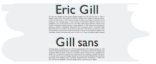
Type On Disc (Booklet) - Gill Sans

Front of cd case
click image to view larger version

cd case opened up
click image to view larger version

back of cd case
click image to view larger version

disc
click image to view larger version

print template
click image to view larger version

print template
click image to view larger version


This project was for my Typography class. The assignment requirements were:


Create a booklet for a CD containing both the True Type and Open Type (.TTF and OTF.) versions of a typeface.
This booklet should display a minimum of three members of the type family (roman, italic, and bold) and give background information on both the typeface designer and the typeface itself, situating the importance of the typeface and typographer historically.
There should be a minimum of 200 words of historical information.
You may use black, white, and two colors.
The alphabet must be represented in upper and lowercase its entirety in roman, italic, and bold.
There is not a size (and consequently not a page number) specification for the booklet, other than that it must hold a CD. That gives us a minimum size specification of 4.75"
One page must contain a letter whose height (either cap-height or x-height, depending on the case) is 4.75".
There should be an image of the original typeface.
BLACKLETTER:
Fraktur
Cloister Black
Goudy Text


OLDSTYLE:
Bembo
Caslon
Dante
Garamond
Janson
Jenson
Palatino

TRANSITIONAL:
Baskerville
Bulmer
Georgia
Joanna
Perpetua
Times Roman

MODERN:
Bell
Bodoni
Caledonia
Didot
Modern No. 20
Torino
Walbaum

EGYPTIAN, SLAB SERIF, or SQUARE SERIF:
Century
Clarendon
Lubalin Graph
Memphis
Rockwell
Serifa

SANS SERIF:
Akzidenz Grotesk
Grotesque
Gill Sans
Franklin Gothic
Frutiger
Futura
Helvetica
Meta
News Gothic
Optima
Syntax
Trade Gothic
Univers

Early Letterform - Epsilon


This was a project for my typography class. The project requirements were:


Project 1: Early Letterform
Assignment:
Select a letter from the Phoenician or Greek alphabet, research the letter, and write approximately 100 words.

Create four two-color designs, each distinctively different, using black and red as shown in the examples. Incorporate your copy into each design. In the first design make the symbol the most prominent element. In the second make the display type the most prominent element. In the third make the text type the most prominent element. All design elements should be two-dimensional. In the final comp make the symbol the most prominent element again.


Each design should be 8" x 8".
It is your choice which of the colors, red, black, or white is used for the page, for the symbol, for the text and display type.
For your text and display type, use one of the 5 typefaces we have been working with thus far:
Garamond
Baskerville
Didot
Century Schoolbook
Helvetica
Consider the following issues:
Colors and textures created through letter, word, and line spacing.
Legibility based upon tracking and leading.
Shape created by counterform and the influence on the perception of the composition.
These will be among the topics discussed in critique.

Visual Definitions


Dictionary Cover, Spine, and Back

Inside Flaps

Spread 1 : Simplicity

Spread 2: Crowded

Spread 3: Contrast


This is a work in progress for my typography class. We had to design 3 spreads that defined a word both visually and verbally. These 3 spreads had to be done in the same style and be a part of the same set. We also had to design the dust jacket for the dictionary. I went with a simple clean style and am very happy with the results.

Infographic


This was a project for my advanced graphics class. We had to design a graphic that represented data. I took the approach of doing a timeline that documents the change in audio format. I used a very simple design for this project, and think the black and white works very well with the vector art and use of type.

Teach a Martian To Tie A Shoe - Cassette Tape


click the image in order to view a larger version

This was a project for my advanced graphics class. We had to use icons developed in a previous excersise in order to convey a set of instructions. We were not allowed to use words or letters, and the design had to be straight forward and easy to understand across the language barrier.

Design An Imaginary Beverage - Superhero Sludge

click the image to view a larger version


For this project, we were told to design a new beverage. We were to come up with the packaging as well as a poster using just the image of the beverage itself. No text other than what would be found on the label or packaging of the product. We were also required to answer the following questions:

What does it taste like?
  Overly Sweet thick beverage that has the consistency of sludge.

For whom is it designed?
   Anyone who secretly possesses the desire to live out the double life of a super hero, from nerd to extremely successful buisnes man. If you intend to bring forth justice in the world while wearing a tight fitting costume year round, this is the beverage for you.

What sort of mood or feeling does it convey?
   You feel unstoppable. You are on top of the world and feel the conviction to right all wrongs.

Whom do you get to pretend you are when you drink it?
   You get to pretend you are your favorite super hero. Possessing your favorite superpowers and loved by all!

How do you get to pretend you feel when you drink it?
   You pretend to feel like nothing can hold you back. All tiredness, laziness and any crappy feeling instantly fades away. You have a perfect smile, everyone loves you, and you can do anything and everything you've ever wanted!

Graphic Timeline - Billboards

Click the image to see the full timeline

This project was for my History of Design class. We were told to make a graphic representation of something related to graphic design. I used illustrator and photoshop to highlight some important dates in the history of the out door advertisement.

Revealing A Hidden Truth - Shyster Card

click the image to view a larger scale version.

click the image to view a larger scale version.


This project was also for my Intro to Digital Studio class.
Artist Statement:
 Our project was centered around the idea of "revealing a hidden truth". This made me think about what things in our life we lie to ourselves about. Debt is definitely a dominat thing in our society. Our country runs off it! The credit card companies tell us if we cant buy something that its just a figment of our immagination. Charge it! I organized this project as if it were an ad campaign. If you click on the link below, you can see the mock creative brief that I constructed. The project was presented in a folder as if being presented to an advertising firm.

Documentation Site - Rockerball

Click the image to go to the live website.


 This project was for my intro to web based art class. We were required to document a process, or an event. Rockerball is a game a couple of my friends made up utilizing a racquetball court, and a partially deflated soccerball. The site documents the playing of the game, as well as teaching someone who was interested in learning how to play. I went with a really minimalistic design because the game itself is really simple and fun. I did not code the javascript, but I did mess around with some of the options in order to tweak it to meet my needs.

Documentation Site - Hotdog Man

click the image to go to the live website

This project was for my Intro to web based art class as well. For this assignment, we were dealing with the idea of urban legends and myths. How do things start and spread? A couple of our classmates took turns wearing a hot dog suit and made appearances around campus. Flyers were made and pictures/videos were taken. After the event happened, each student had the task of documenting the event taking any voice they wanted. I chose to talk about the hot dog man as an onlooker conveying that he was real, and represented him in a positive light.